


Nowadays, typefaces are a dime a dozen; there’s certainly no shortage of free fonts. But as in any artistic field, the standouts are rare, and understanding why they excel takes gradual experience.
In this yarn, we’ll take a closer look at inspiring stories behind the design of typefaces that you may have seen or used but didn’t know the history of. We’ll explore the nooks and crannies — both literal and figurative — of the evolving printed word. By the end, we hope you come away with a better appreciation of how things came to be.
1. Sign language: of subways and skies
The signs are all around us: both text and pictograms that indicate where to go, what not to do and situational info. Simply S-P-E-L-L-I-N-G it out is insufficient. A modern descendant of ancient hieroglyphs, stylized text enhances understandability and, hence, memorability. Many public transportation systems in cities around the world have gone through progressive transformations; like a bric-à-brac cake, new layers don’t just replace old ones but are often built on top of previous structures.
by FredoAlvarez
The subways of New York City are one such example. While the crisp, nearly universal Helvetica -- the subject of its own documentary -- now flanks its tunnels, it wasn't always this way. Paul Shaw investigated the subway's depths and wrote an intensely dense article, which I highly recommend. Delving into the various NYC subway typefaces used over the past few decades, with plenty of pretty useful imagery, the article is a treasure.

by Catchpenny
Furthermore, iconic typography need not be limited to real-life transportation systems: you only need to turn on shows like Lost, with its Oceanic Airlines logo, and the Hanso Foundation’s Bagua-inspired badges. Or what about the cyberpunk trappings of The Matrix Reloaded, in which Mobil Ave is shown on stark tiles before Neo confronts The Trainman?

by gulicious
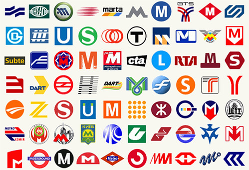
Fresh inspiration can be gleaned by glancing at logo compilations. You’re likely familiar with many airline logos, but lesser-known are subway logos from around the world, such as the ones in this impressive collection:
by Annie Mole
Note the prevalent use of certain letters (in particular, M and S, for “Metro” and “Subway”), which are integrated in the designs. Most of the logos are simple but have diagonal or curved lines, suggesting motion. Others rely heavily on circles, lending a feel of the “round trip.” But however you analyze them, it’s clear: no great trip into the city is complete without a keen aesthetic touch. And if you crave more, here you are!
2. Metafont: Don Knuth’s math mastery
It’s a rare soul who dedicates most of his life to an ambitious project that transcends his own existence and influences many in the process. I refer to legendary computer scientist Donald Ervin Knuth, whose speech is shaky but writing is sound, and whose home page looks like a Mosaic relic yet contains mounds of unique genius. (Maybe we could hook him up with some of our native talent?) He even knows how to “get down”!
by ioerror
Synonymous with excellence in computer science because of The Art of Computer Programming (ongoing since 1962), one of his lesser-known and lesser-used works outside of intellectual fields is Metafont, which wields great precision in creating vector fonts.
It’s amazing that one person can do so much and, not only that, keep at it. Case in point: Metafont continues to be updated but comes from a base developed in the late 1970s. Also, any typographer worth her ink (virtual or otherwise) is familiar with Hermann Zapf of Zapf Chancery fame (which I first became acquainted with through my high school’s LaserWriter). Or perhaps you’ve heard of Zapf Dingbats?

by Kent Wang
Anyway, Knuth and Zapf collaborated to combine intricate computations based on the centuries-old growth of movable type – elegant equations that form beautiful characters. Keep in mind that in some circles there is a conceptual divide between tradition and technology, and these ideas were often shunned or outright lambasted years ago.
But they didn’t give up. Far from being two old fogeys awaiting the Grim Reaper, Knuth and Zapf, grandmasters of their respective fields, continued to passionately push forth, even though newer generations know not of their original works, only of mere knockoffs and jokes.
If you haven’t heard of Metafont, let alone used it, even Knuth concedes it’s too difficult for some to use:
“Asking an artist to become enough of a mathematician to understand how to write a font with parameters is too much. Computer scientists understand parameters, the rest of the world doesn’t.”Admirable how instead of waiting for the world to catch up, Knuth forged ahead with impeccable precision. We’re still feeling the effects through our PostScript and TrueType vectors now. It’s also interesting how we’ve moved so far past bitmap fonts, in part thanks to Metafont, but pixel fonts continue to find their way into Flash animations and lo-fi tributes.
3. Opening titles: Kyle Cooper’s movie magic
Kyle Cooper isn’t a computer scientist, but he does have something strongly in common with Don Knuth: he takes a driven, focused interest and becomes the best at it. On occasion, when Smashing Magazine has published lists of impressive motion graphics, Kyle Cooper gets called out in the comments, as in “You missed mentioning him!” I don’t think he gets enough credits (pun!), so here’s his due.Sure, Saul Bass brought love and life to cinematic type sequences and continues to inspire posters in his style from beyond the grave…

by jamacdonald
… but in the present, Kyle Cooper rules with a diverse, deft touch. Learning from the late Paul Rand (who was like the Elvis of graphic design, sans impersonation), Cooper created work that stretches from the grimy, unnerving sleaze of Se7en to the neo-militarism of the Metal Gear Solid games. His work leads to many forum questions like, “Where can I get the font in that movie’s credits?” He’s even played a major role in revitalizing comic book movies with the Spider-Man titles, as detailed in this Wired article. Pop your eyes out with his 2006 demo reel:
So the next time you’re at the movies and being wowed at the beginning, look up who’s responsible, and it’s likely you’ll find Kyle Cooper or one of the many who have been influenced by his trendsetting ways, turning the intro tease into an art form all its own. As was the case with the cracktros that preceded Commodore 64 titles (an unlikely comparison), sometimes the appetizer is better than the entrée.
Cooper’s entry in the Monographics series is well worth the stare into the artist’s mind.
4. LilyPond: notation sensations
Music notation is a special kind of typography of its own. Like the language of literal type, the classical “staff view” possesses its own breed of ligatures and accents. Much the same way that calligraphy often expresses the intent, even the “soul,” of the creator, handwritten music script conveys much of the composer’s temperament. To the untrained eye, notation can look the same: notes, slurs and pedal markings are all in plain sight. But like a golf pro following through, there’s a flow underpinning everything that happens.
by pfly
That's where LilyPond comes in. Similar to Metafont in the respect that it's a blend of art and science, LilyPond helps create beautiful engravings. Think about how kerning on the computer makes digital typography flow better; LilyPond works on a similar principle for musical glyphs. It even has its own typographical features, which are readily apparent after the fact. LilyPond is among the latest in a long line of music notation software and certainly takes an original approach. I remember playing with the Music Construction Set by Electronic Arts (before it was a multi-national behemoth) in the '80s on my Commodore 64, and that was a time when editing movies on your home computer was unthinkable. The democratic waves of technology continue to be dispersed, and open source has benefited from the contribution of LilyPond. Alas, like Metafont, LilyPond is highly technical: an input file resembles a programming language and isn't as intuitive as putting pen to paper. However, it may be easier than you think. The degree of control it offers is astounding. But LilyPond's true promise could lie in bridging the gap between ease of use and incredible depth, much the same way as WYSIWYG-style rich-text editors have promised since the dawn of selectable fonts on the computer. This is controversial for some but needs to be contended with. And writing of controversy…
5. Comic Sans: who's laughing now?
This is not a joke. But there is a valuable lesson herein, given all the design excellence we have featured here. Bear with me: many professional typographers loathe Comic Sans, which is, oddly enough, a fitting testament to its stand-out presence in a sea of look-alikes. Comic Sans is a curious cultural case that not only has spawned haters who vigorously oppose it, but paradoxically continues to live on with increased usage. From its origins, being plastered across the word bubbles of Microsoft Comic Chat, to more contemporary uses, such as the packaging of the top-selling game The Sims, Comic Sans has more lives than a cat! Can you spot the irony in this?
by Andreas_MB
Its creator, Vincent Connare, is perfectly capable of creating marvelous typefaces, so what went wrong here? We shouldn’t lay the blame on Comic Sans itself, but rather on how it’s being used, much like a poorly sized screwdriver stripping a screw. After all, each typeface carries its own “signature,” which is why flourish-filled simulated handwriting is favored for wedding invitations and big block typeface adorns pro sports jerseys.

by mactiste
Like generic clip art tastelessly resized and aliased (which is enough to make anyone who knows better grind their thumbs into their eyes) Comic Sans is often abused in inappropriate contexts. Poor font. Connare says:
“There was no intention to include the font in other applications other than those designed for children when I designed Comic Sans. The inspiration came at the shock of seeing Times New Roman used in an inappropriate way.”Be sure to see the Comic Sans documentary, which is the intriguing antithesis to Helvetica:
I’m never one to withhold what the creator has to say, and now you know the rest of the story.
Throughout these five tales, we’ve seen feats, fables and foibles. There are many more stories to be told, both those that lie undiscovered and wait for a voice to shine on them like a light, and those that will soon be in the making as a result of your creative energies.
Related resources
- Smashing Magazine’s Free Fonts
- Sexy, Bold and Experimental Typography
- Vintage and Retro Typography Showcase
- Behind the Design: 5 Stories of Great Inspiration
(al)